Examining the viral trend of posting infographics
If you’ve scrolled through Instagram in the past few months, you’ve likely come across aesthetically pleasing, multi-page posts educating users about current issues. These infographics can offer information on anything from how to vote to statistics about systemic racism. But are these graphics positively influencing social media users?
With everyone stuck inside due to the coronavirus pandemic, social media was flooded with support for The Movement For Black Lives after the killing of George Floyd by Minneapolis police. Going beyond simply posting “#BLM” and a black square to show support, users began to share educational infographics with their followers, with many posts quickly going viral.
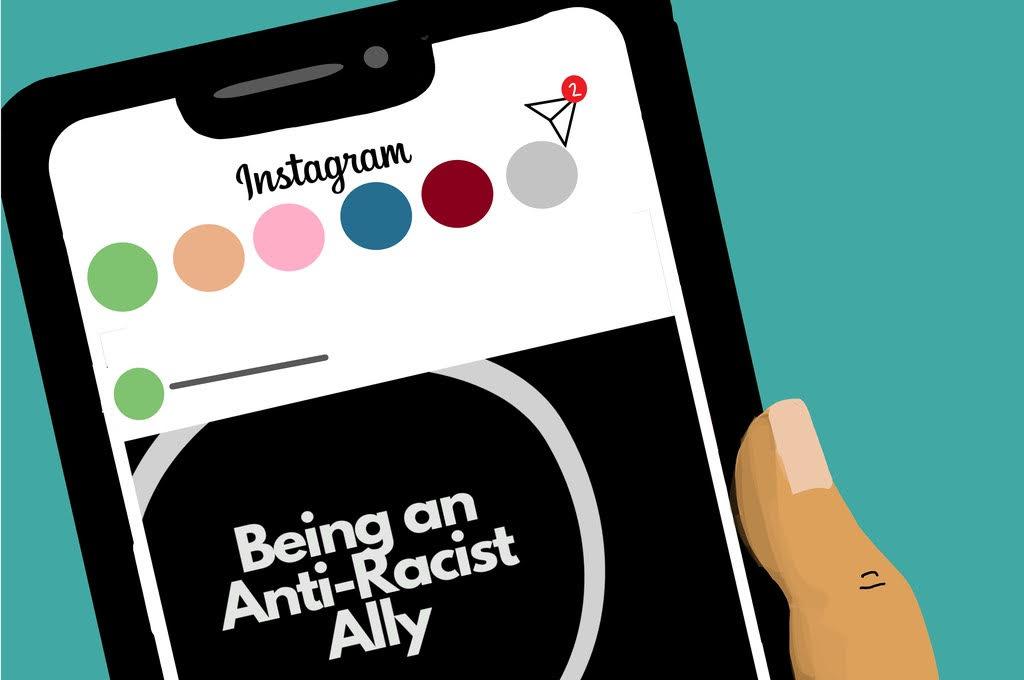
Sophie Williams, a 32-year-old writer from London with the Instagram handle @officialmillenialblack, was one of the first to create a viral infographic posted three days after Floyd was killed. The first slide reads, “Being an Anti-Racist Ally,” followed by nine slides with tips, such as “just listen,” or the difference between nonracist and anti-racist. Williams did not have a large following when she posted this, and had no idea it would be seen by hundreds of thousands of people and even be re-shared by Justin Bieber.
The format of infographics similar to Williams’ makes them easy to understand and digest, with just one piece of information on each slide, often accompanied by bold fonts and highlighted key words.
Artists have made infographics that are easy to understand for viewers. Pan Cooke, an Irish portrait painter with the Instagram handle @thefakepan, used a comic format to tell the story of Eric Garner, who was killed in 2014 by a police officer who put him in a chokehold as he pleaded, “I can’t breathe.”
“I decided to use the same comic format I had used during lockdown to educate myself about realities and stories I had been passively ignorant to in the past,” Cooke told Mashable.
Some have criticized the formats of these infographics, whether they use fun, colorful fonts like Williams, or graphics like Cooke, to discuss serious topics like racism and sexism.
The creators argue that they must use “Instagrammable” aesthetics and formats in order for the information to be spread on the platform. Some creators have also been criticized for spreading false information, as they may not fact check every detail.
However, since these infographics are so widespread, people have begun citing their sources on the graphics. The creator of the Instagram account @soyouwanttotalkabout, who only goes by Jess, said in an interview with Vox, “I think what I did stood out in the beginning because I was including sources at the bottom of every slide. I’m glad to see more people doing that now, but I mainly try to source from .edu or .org websites, or even the actual U.S. government.” If there is an infographic without cited sources, one should definitely be wary of what they are sharing with their followers.
A major problem during these times when activism is expected of everyone is that it becomes performative activism. This occurs when people do something on social media, like post a black square on Blackout Tuesday, and do nothing outside of social media, like attend a protest or write letters to politicians.
I would argue that infographics are much less performative than posting a black square, as it not only shows support for a movement but aims to educate others. They can also be used to encourage activism outside of social media, such as guides about how to register to vote. However, it is important for users to utilize this information by turning it into action.
It is clear that Instagram is more than selfies and food pictures. It is a platform for activism. These infographics help to make activism more accessible and visible to those who aren’t completely civically aware. This “trend” is the first step in becoming better activists and allies.


